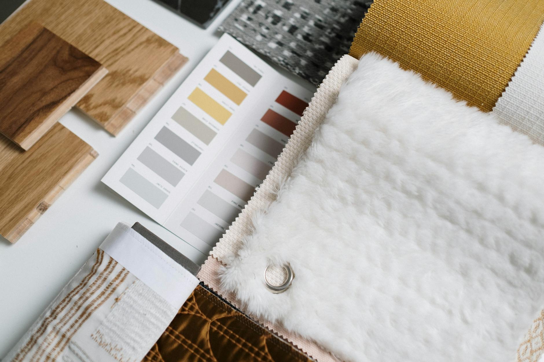
A room feels cohesive when a small set of colors and materials repeats on purpose. Pick a base color for large surfaces, a secondary color, and one accent. Choose three to five materials, and make sure each color and material shows up at least three times in different places. Repetition, not matching, is what makes a room look planned.
Rooms look scattered when every item is a separate decision: a blue rug, a green sofa, an orange chair, and four different metals. The sections below give you a method for building a palette, a rule for distributing it, and ways to handle texture, finishes, and undertones so the pieces read as one scheme.
Start with a palette of three roles
Most cohesive rooms use a simple structure often called the 60-30-10 rule. It is a guideline, not a law, but it gives you quick proportions:
- 60 percent dominant: the wall color, large rug, and big furniture such as the sofa. This should be your quietest color.
- 30 percent secondary: curtains, an accent chair, bedding, or a second wall.
- 10 percent accent: pillows, art, vases, and small objects, where you can use stronger color.
Neutrals count as colors. White, cream, greige, charcoal, and black can fill any of the roles, and a room built from two neutrals plus one color usually looks calmer than three bold hues. If you are unsure, start from one fixed item you love or already own, such as a rug or a piece of art, and pull the palette from it.
To test a palette, collect paint chips, fabric swatches, and wood samples, and tape them together on one wall for a few days. Look at them in morning, afternoon, and evening light, since colors shift. Sample pots are cheap compared with repainting a room.
Check the undertones
Two colors that look alike in a store can clash at home when their undertones differ. Whites can lean warm (cream, yellow) or cool (blue, gray). Grays can lean blue, green, or purple. Beiges can be pink or yellow. Mixing a warm white wall with a cool gray sofa often looks slightly off, even when no one can say why.
A quick check is to place samples side by side on a white sheet of paper. Ask which looks more yellow, pink, green, or blue. Stay consistent:
- Warm scheme: cream, tan, terracotta, warm wood, brass
- Cool scheme: gray, blue, cool white, ash wood, chrome or nickel
- Mixed scheme: use one temperature as the base and the other for a small accent
The same logic applies to wood. The guide on mixing wood tones without making a room look messy covers undertone and depth for floors and furniture.
Choose a limited set of materials
Materials give a room texture, and texture is what keeps a limited palette from feeling flat. Cohesion comes from choosing a few and repeating them.
A workable set for one room might be:
- One main wood tone
- One metal finish (such as matte black or brushed brass)
- One or two textiles (such as linen and wool)
- One hard material (such as stone, ceramic, or glass)
- One natural fiber (such as rattan, jute, or seagrass)
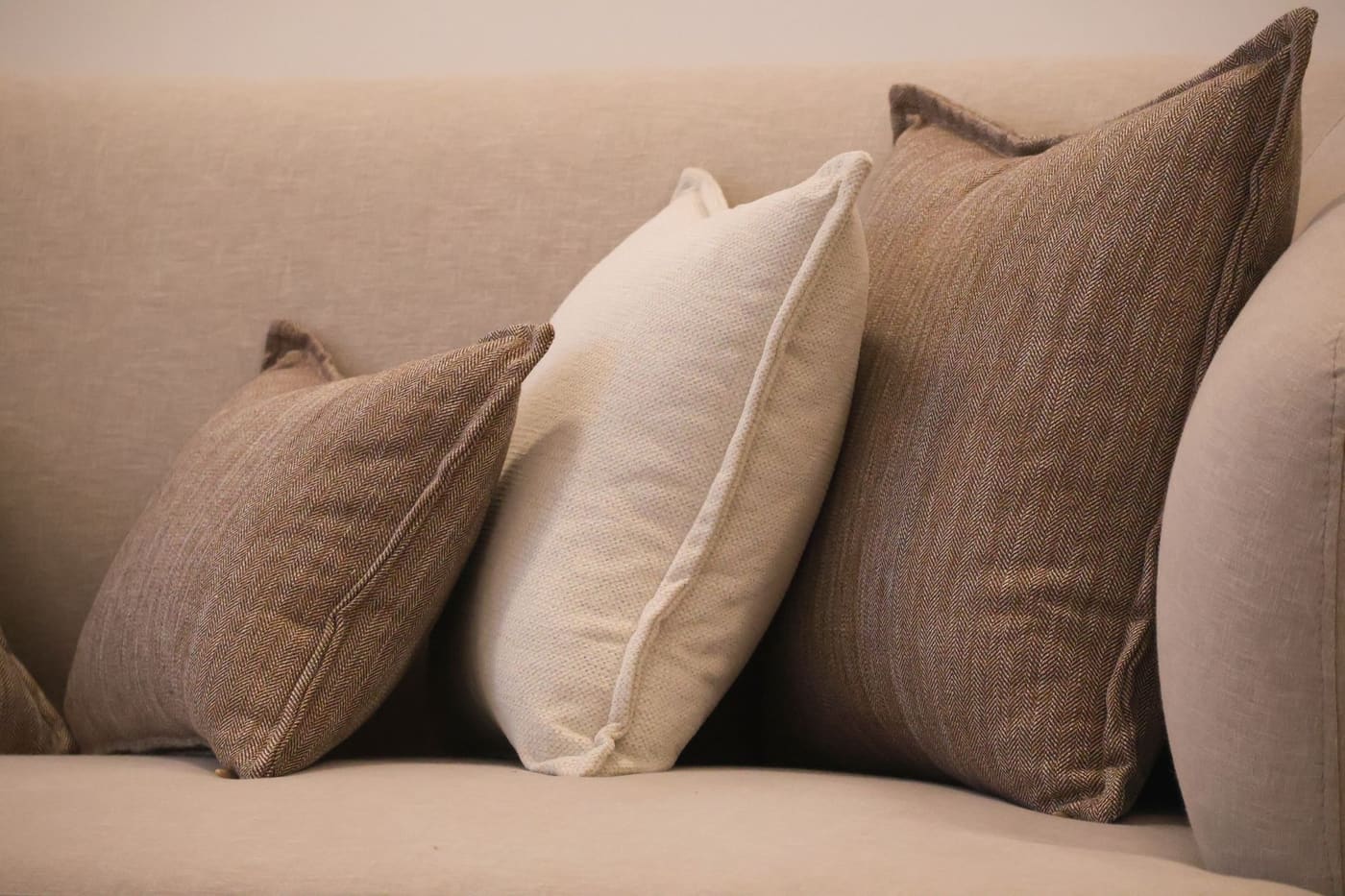
Using more than five makes it hard to repeat anything. Using fewer than three can make a room feel bland. A good rule is to repeat each material in at least two places: black metal in a lamp and a picture frame, a woven basket and a woven chair, linen in both curtains and a pillow.
Metals deserve special care. Mixing two metals can work, such as black and brass, but mixing four looks random. Choose one primary metal for most of the hardware and fixtures and a second for small accents.
Distribute color around the room
A color that appears in only one spot looks like an accident. Spread each color through the room in a triangle or zigzag pattern so the eye moves around.
Practical distribution:
- If the sofa is navy, put navy in a pillow on a chair across the room, in a piece of art, and in a small object on a shelf.
- If the accent is rust, place it low (a pillow), middle (a vase), and high (art or a lamp shade) so it moves through different heights.
- Do not cluster all of a color in one corner, which pulls the room off balance.
The same idea helps connect rooms that open to each other. Carry one color or one material from the living room into the dining area or hall so the home flows. For finishing touches that repeat the palette without cluttering it, see the advice on finishing a room without making it look cluttered.
Use pattern and texture carefully
Pattern adds interest, but it needs rules too. A common approach is three scales: one large pattern, one medium, and one small, sharing at least one color. For instance, a bold floral pillow, a medium stripe on a chair, and a small check on a throw, all using the same navy and cream.
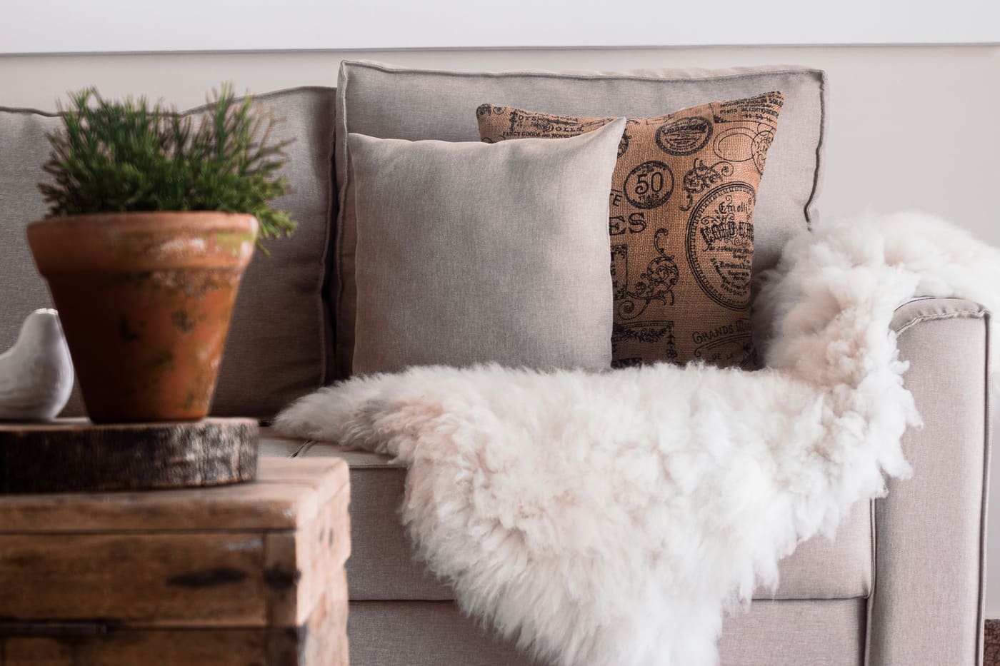
Texture can do some of the work that pattern does. If the colors are tight, such as all neutrals, add variety through texture: nubby boucle, smooth leather, rough linen, knit wool, matte ceramic, and glossy glass. A monochrome room with only one texture looks flat, while a monochrome room with several textures looks rich.
| Approach | Best when | Risk |
|---|---|---|
| Tonal neutral palette, many textures | You want calm, a small room, or a quiet bedroom | Can feel flat without texture |
| Neutral base with one accent color | Most living rooms | Accent used only once looks random |
| Two or three colors from one source | You have a rug or art you love | Needs repetition to feel balanced |
| Bold, saturated palette | Large rooms, a room you want to feel dramatic | Harder to keep balanced |
Account for light
Light changes color all day. In the northern hemisphere, north-facing rooms get cooler, bluer light and south-facing rooms get warmer light, so the same gray may look blue in one room and warm in another. Test samples on the wall where they will go, and check them with your lamps on, since bulb temperature shifts color as well.
Bulbs rated at about 2700K make warm tones richer, while 4000K or higher can make creams look sterile. Choose a bulb with a high color rendering index, often listed as CRI 90 or above, so fabrics and wood look true. The article on lighting that makes a room feel better and more usable explains bulbs and layering in more detail.
Work with what you already own
You rarely start from scratch, so build the palette around fixed items: a floor, a sofa, kitchen cabinets, or tile you will not replace. Identify their undertone and material, then choose the rest to relate.
Low-cost ways to bring things together:
- Paint: A gallon commonly covers about 350 to 400 square feet; check the can.
- Swap hardware: New pulls and knobs on a dresser or cabinets can unify metals.
- Re-cover pillows: Pillow covers are inexpensive and change a scheme fast.
- Spray paint small items: Lamps, frames, and vases can be painted in your chosen accent or metal color. Use it outdoors or in a well-ventilated space, with a respirator rated for the product.
EPA guidance says paint in homes built before 1978 may contain lead, so test before sanding or scraping, avoid dry sanding, and use a lead-safe certified contractor for work that disturbs it.
Edit with a final walk-through
Once the room is assembled, stand in the doorway and ask:
- Can I name the dominant color, the secondary color, and the accent?
- Does each color appear in at least three places?
- Do all the woods and metals share a temperature, or is the contrast deliberate?
- Is there a mix of textures, such as something soft, something hard, and something natural?
- Is any single item pulling attention for no reason?
Take a photo, since it shows imbalance faster than your eye does. Fix the biggest problem first, and live with the room for a week before buying anything else. Adjust furniture placement too, since cohesion also depends on layout, and the room layout guide covers how to arrange pieces so they relate.
Where this comes from
The 60-30-10 proportions, repeated materials and undertone checks are common interior-design guidelines, not fixed rules. Bulb color and color rendering advice follows general lighting-efficiency guidance, and the lead-paint point follows U.S. EPA lead-safe renovation guidance. Prices, product specifications and local rules change, so check current figures with the seller, manufacturer or local authority before you buy or start work.