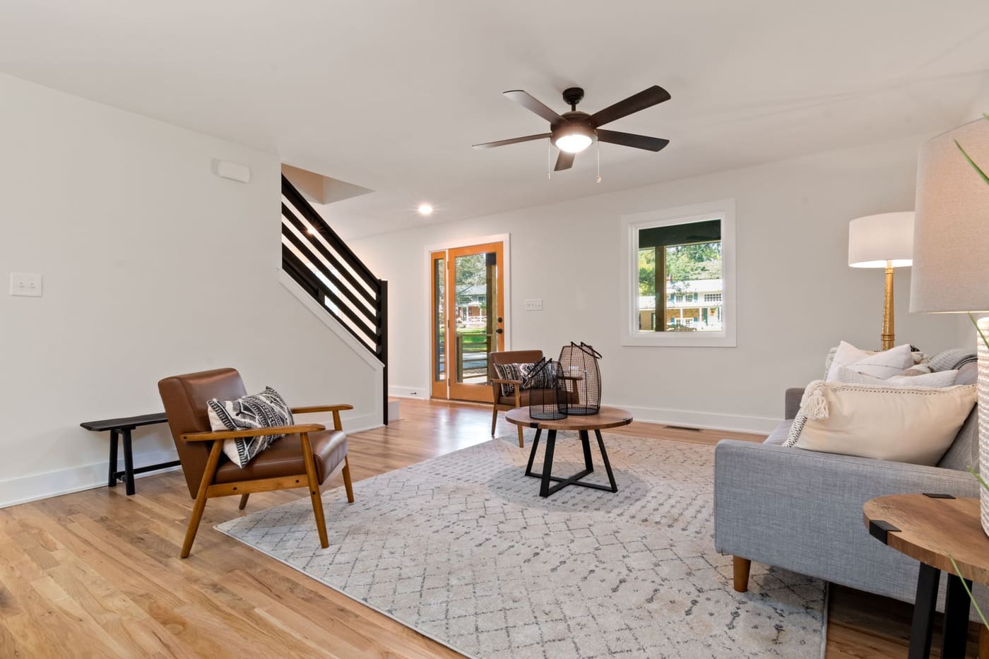
You can mix wood tones by choosing one dominant wood, adding one or two supporting tones with a clear difference in depth, matching undertones, and repeating each tone at least two or three times around the room. Mixed woods look intentional when there is a pattern to them, not when every piece is a slightly different brown.
A room full of perfectly matched furniture sets often looks flat, and a room with five unrelated finishes looks messy. The middle path is easy once you know three things: how to read undertones, how to set a hierarchy, and how to repeat. The sections below cover each, with a step-by-step method you can use with furniture you already own.
Read the undertone first
Wood has an undertone, just like paint. Undertones fall roughly into warm (red, orange, golden, yellow), cool (gray, ash, taupe, sometimes pinkish), and neutral. Oak is often golden or yellow-toned, cherry and mahogany are red, walnut ranges from neutral to cool brown, and weathered or limed finishes lean gray.
To check an undertone, hold a piece next to a sheet of plain white paper or a white shirt in natural daylight. Ask whether the wood looks more orange or yellow (warm) or gray or ashy (cool). Compare two pieces side by side, not from memory.
The practical rule is simple:
- Matching undertones nearly always work together, even when the depth differs.
- Clashing undertones, such as a reddish cherry next to a gray-brown ash, look off unless you separate them with a neutral or a different material.
- One cool piece in a warm room can work as a deliberate contrast, but one is plenty.
When two woods are close but not identical, such as two medium browns with a slight shade gap, they tend to look like a mistake. Either make them match more closely or push them further apart in tone.
Set a hierarchy: one dominant, one or two supporting
Pick a dominant wood. A common starting ratio is roughly 60 percent dominant wood, 30 percent secondary and 10 percent accent. The dominant wood is often the floor or the largest furniture piece. Three wood tones is a comfortable ceiling for most rooms, and two is easier.
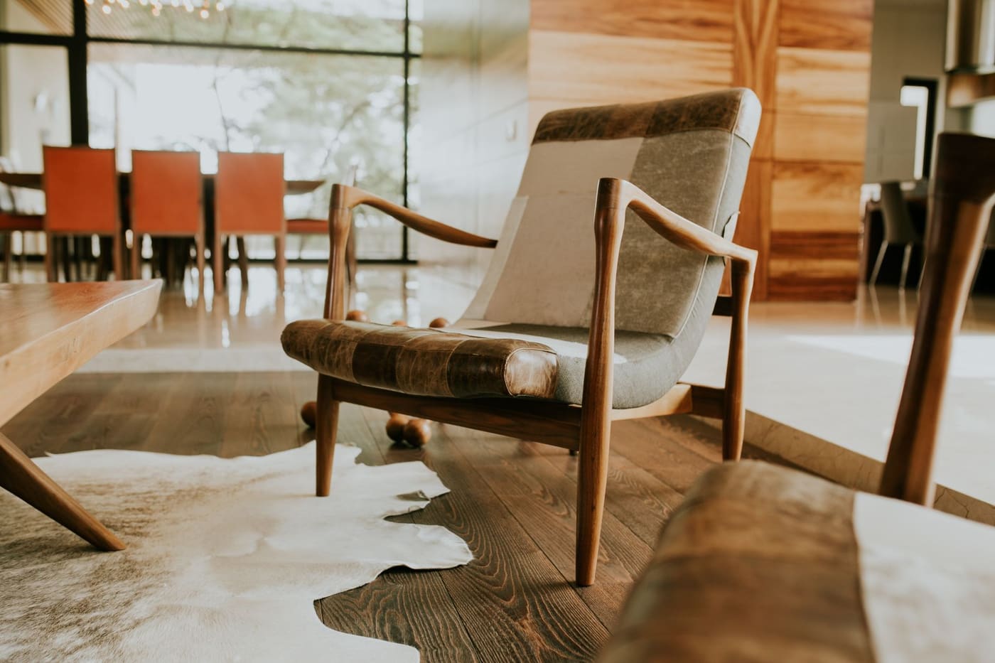
For example, in a living room with medium oak floors:
- Dominant: oak (floor and coffee table)
- Secondary: a darker walnut media console and side table
- Accent: a lighter ash or birch picture frame, stool, or bowls
Treat the floor as a fixed element. If the floor is a mid-tone wood, you can add lighter and darker pieces around it. If it is dark, a few lighter woods will stand out and keep the room from feeling heavy. Rugs, upholstery, and large pieces of art sit between woods and help them relate, as the guide on using color and materials so a room feels cohesive explains.
Vary the depth, not just the color
Mixed woods look better with a visible gap in lightness. Two woods that are only slightly different in depth look accidental. Aim for a noticeable step, such as a light wood against a dark one, with a mid-tone as a bridge if needed.
| Combination | Result |
|---|---|
| Light oak and dark walnut | Strong contrast, clear and deliberate |
| Medium oak and medium maple | Too close, can look like a mismatch |
| Light ash, mid oak, dark walnut | Layered, works with a neutral rug |
| Cherry and gray-washed oak | Clashing undertones, avoid or separate |
A simple test is to take a photo of the room and convert it to black and white on your phone. If every wood looks the same gray, the depth is too similar. If you can see a light, a mid, and a dark, the room has structure.
Repeat each tone so it looks planned
A single dark wood piece in a room of light woods looks like an outlier. The same wood appearing twice or three times looks like a decision. Repeat each tone in different places and at different heights.
Ways to repeat wood:
- Put a dark wood picture frame, a lamp base, or a bowl near the dark console.
- Echo the floor tone in a tray or stool across the room.
- Place the accent wood on opposite sides of the room, such as a stool on one side and a shelf on the other.
- Repeat a metal finish too, such as black or brass hardware, to tie different woods together.
If the room has a lot of wood, repeat tones in small objects, but do not turn every shelf into a wood display. The principle is to build a pattern the eye can follow, a pattern the guide on finishing a room without making it look cluttered also relies on.
Use neutral buffers between woods
When woods are close, separate them. Stand a wood table on a rug, set painted or upholstered furniture between them, or put a sofa between a dark bookcase and a light coffee table. A white or neutral wall behind a piece also helps it stand on its own.
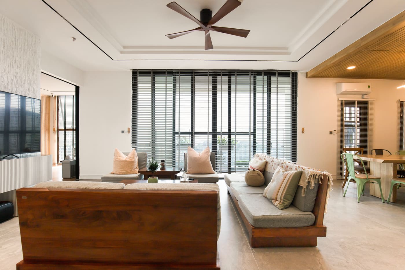
Other buffers:
- Rugs: A rug under a wood coffee table separates it from a similar wood floor.
- Upholstery: Fabric pieces break up runs of wood and rest the eye.
- Metal, glass, and stone: Add a metal side table or a stone top to reduce wood overload.
- Paint: A painted piece, such as a white or black bookcase, acts as a neutral.
Avoid placing two different woods directly touching or overlapping when they are close in tone, such as a dining chair with legs the same shade as but not matching the table. Either choose chairs that clearly differ or match them closely.
Handle grain and finish
Tone is not the only variable. Heavy, busy grain such as quartersawn oak or knotty pine can compete with another busy grain. A good rule is one boldly grained piece per cluster, balanced by smoother wood, such as maple or painted surfaces.
Finish matters too. A glossy finish next to a matte one makes them look unrelated, even if the color is the same. Keep finishes in the same range, such as satin or matte, or use a gloss piece deliberately as an accent. Raw or oiled woods look softer and more casual than heavily varnished ones.
If you are refinishing a piece, test stain on a hidden spot or a scrap first, because the same stain looks different on different species. Sanding and finishing produce dust and fumes, so work outdoors or with good ventilation, wear a respirator rated for the product, and follow the label. Painted or finished surfaces from before 1978 may contain lead. EPA guidance says paint in homes built before 1978 may contain lead, so test before sanding or scraping, avoid dry sanding, and use a lead-safe certified contractor for work that disturbs it.
Mix wood with other materials and light
Wood tones change with light. Warm bulbs, about 2700K, bring out reds and yellows. Cooler bulbs make wood look grayer. Check your pieces under the lighting you will actually use, and see the guide on lighting that makes a room feel better and more usable for choosing bulbs that flatter wood.
Adding other materials also helps spread attention away from the wood: black metal, brass, woven fibers like rattan, linen, leather, and plaster or stone. A mix of three to five materials usually gives a room depth without confusion.
A quick method for a room you already own
- Gather all the wood pieces and group them by undertone: warm, cool, neutral.
- Choose the dominant wood, usually the floor or the largest piece.
- Decide on one or two supporting tones with a visible difference in depth.
- Move pieces that match no group, or paint or refinish them.
- Repeat each tone at least twice in different spots.
- Add buffers, such as rugs and upholstery, between similar woods.
- Take a photo and check the balance in black and white.
Where this comes from
The undertone, depth and repetition advice reflects common guidance from furniture and design publications on mixing woods, including the widely used 60/30/10 starting ratio, and it is a set of taste guidelines rather than rules. The lead-safety point follows U.S. EPA guidance on lead-safe renovation. Prices, product specifications and local rules change, so check current figures with the seller, manufacturer or local authority before you buy or start work.